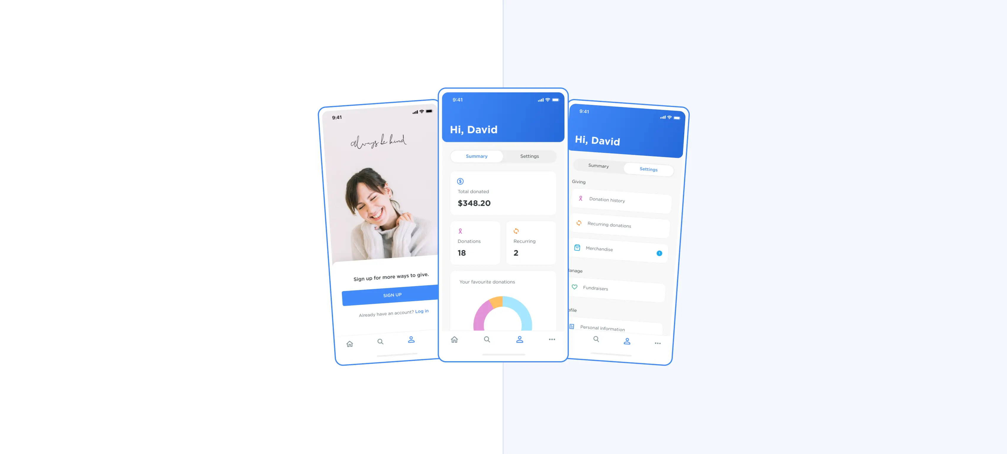
Realigning Shout's web and app platforms
Shout helps charities collect donations, but over time, the Web and App platforms had grown apart. New features were shipping to Web that the App couldn't support, creating an inconsistent experience across both. My task was to realign the two platforms, establish a design direction flexible enough to absorb an upcoming feature roadmap, and uplift the UI across the board.
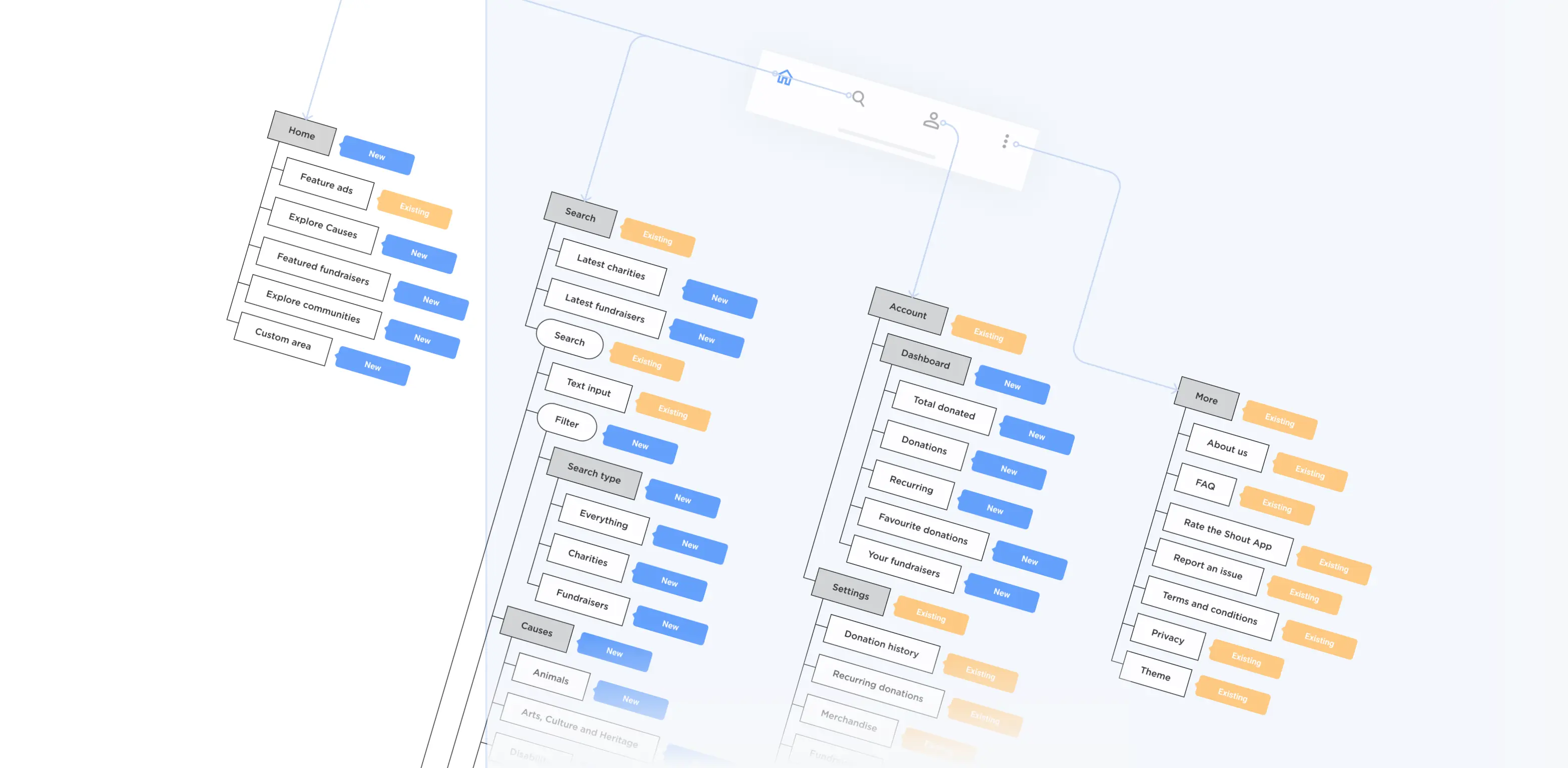
Strategic design direction: An upcoming roadmap of new features meant we needed to strategically adjust the information architecture. A bottom nav bar was introduced (replacing a hamburger menu) to better categorise menu items and improving discoverability.
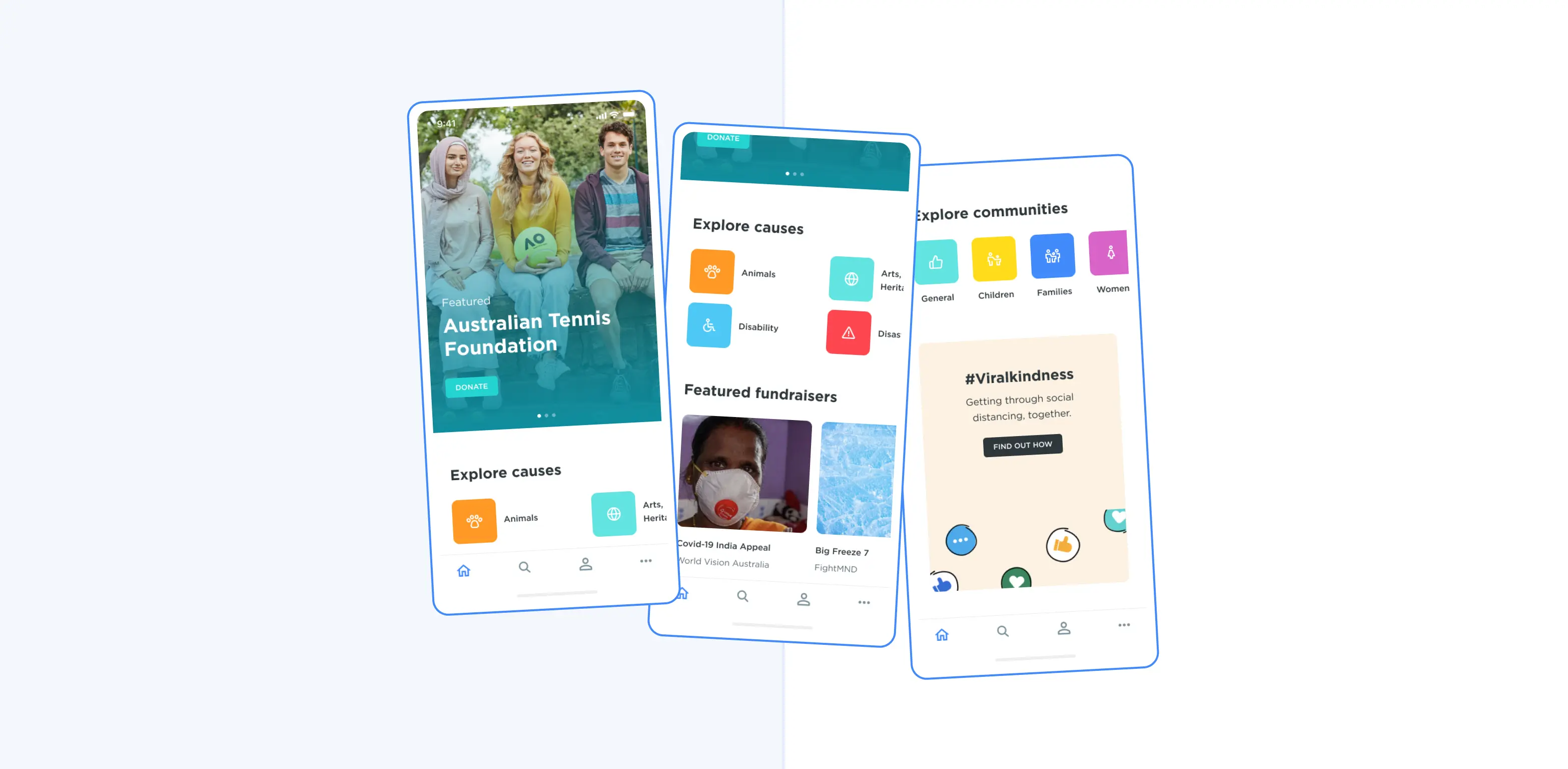
Improved discoverability: The homepage was adjusted to increase the discoverability of both fundraisers and charities. Components were designed to be easily rearranged and reused when upcoming features were added to the App.
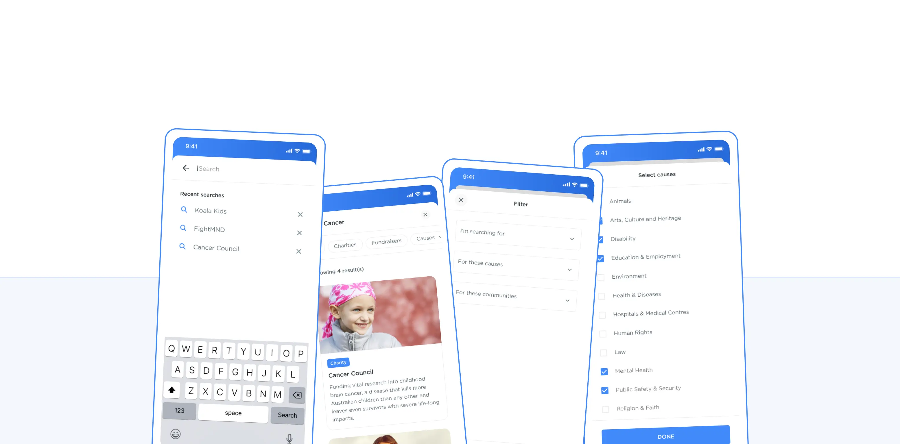
Enhanced search: The search needed to be expanded to fit the addition of fundraisers and the future arrival of auction and ticketing event features. New filtering options improved personalised discoverability by allowing donors to browse specific causes that were important to them.
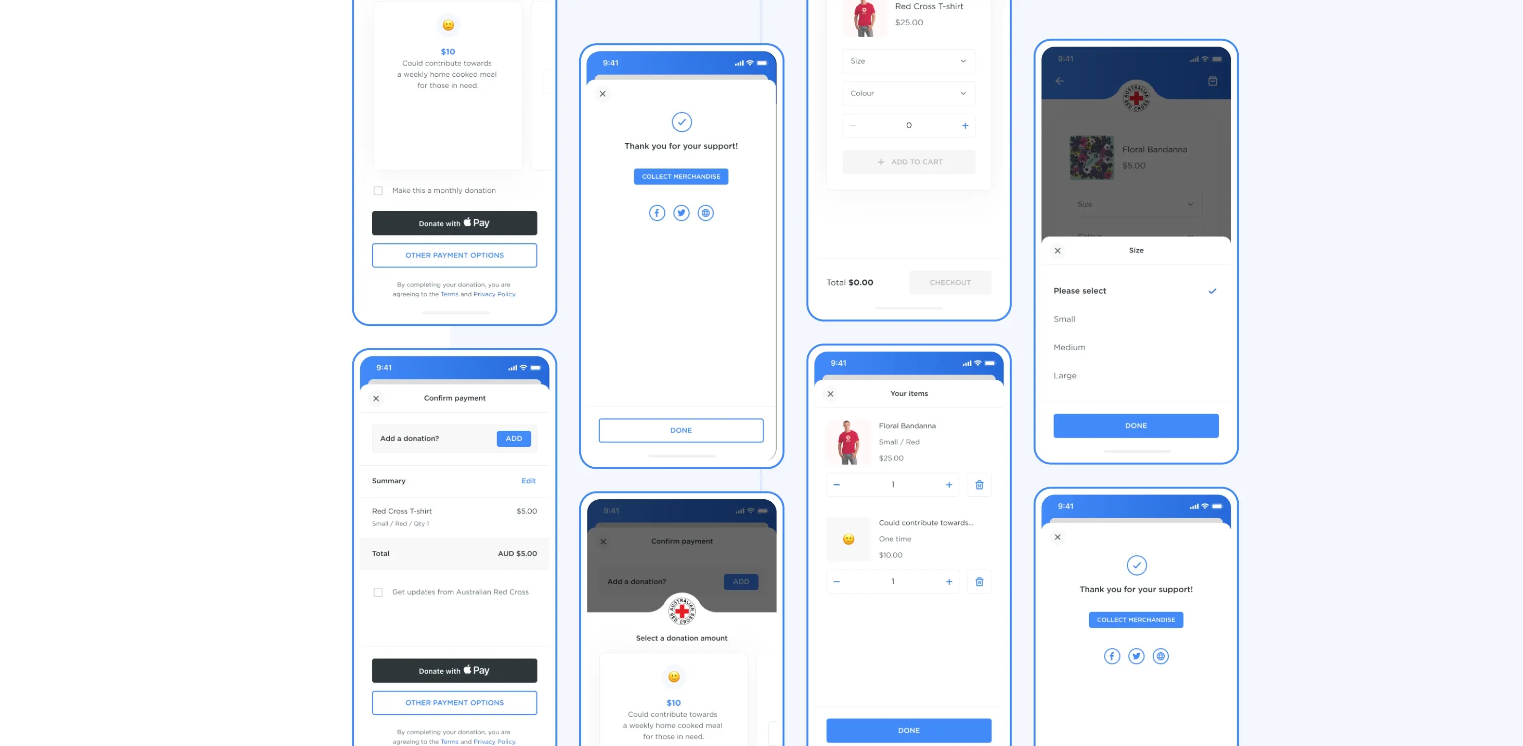
Donations & merchandise: The ability for charities to sell merchandise was one of the more complex additions of functionality to the app. The selling of merchandise needed to consider variants, shopping carts, shipping details and payment methods.
Next Up: